Trends in UI design 2021 that will take your projects to a new level
The best interface is intuitive, gives the user a sense of control, and stands out visually. First impressions matter the most , so staying up to date on trends is essential. Let me present you with the most important trends for 2021. I hope you’ll get inspired!

Microinteractions
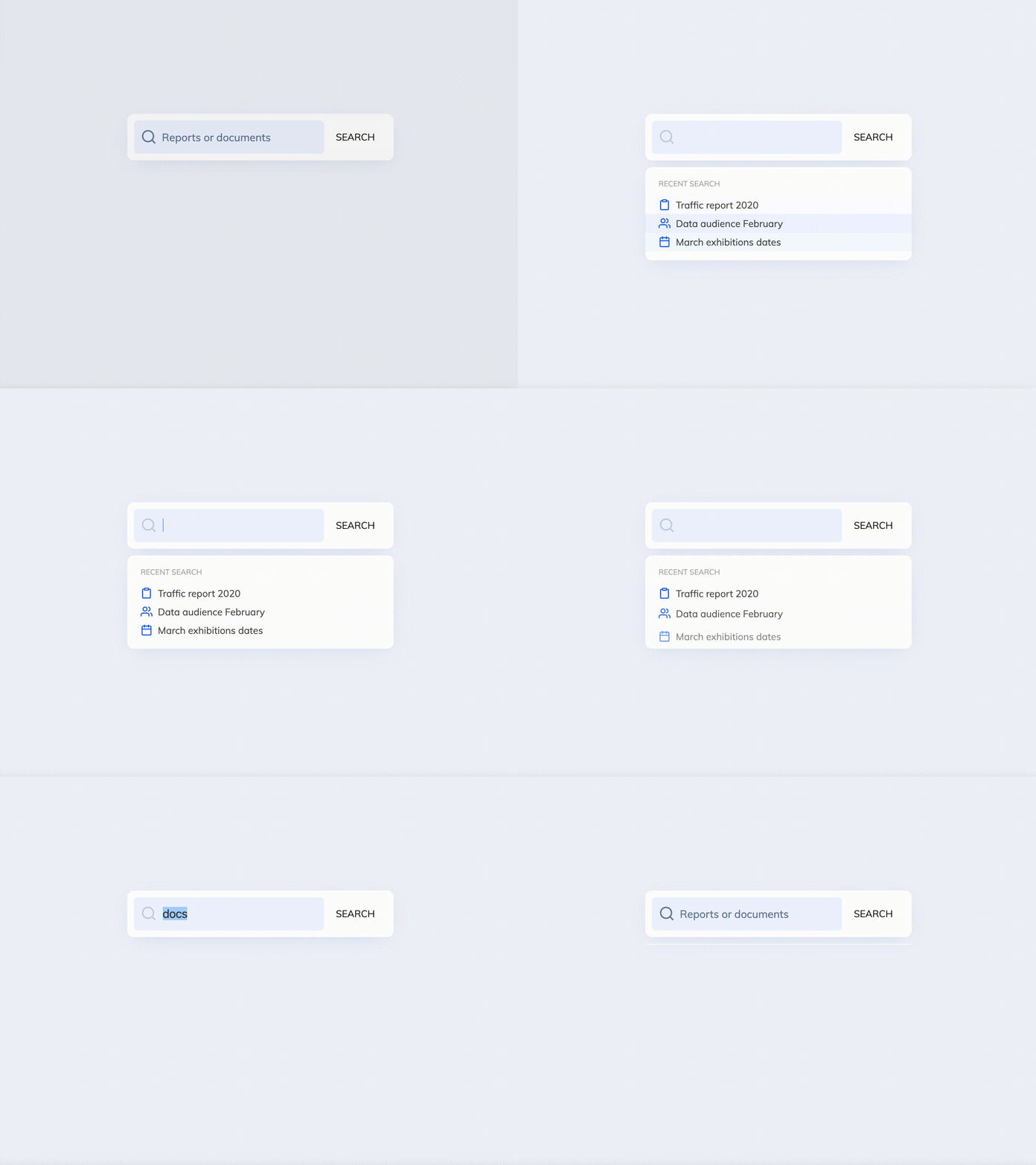
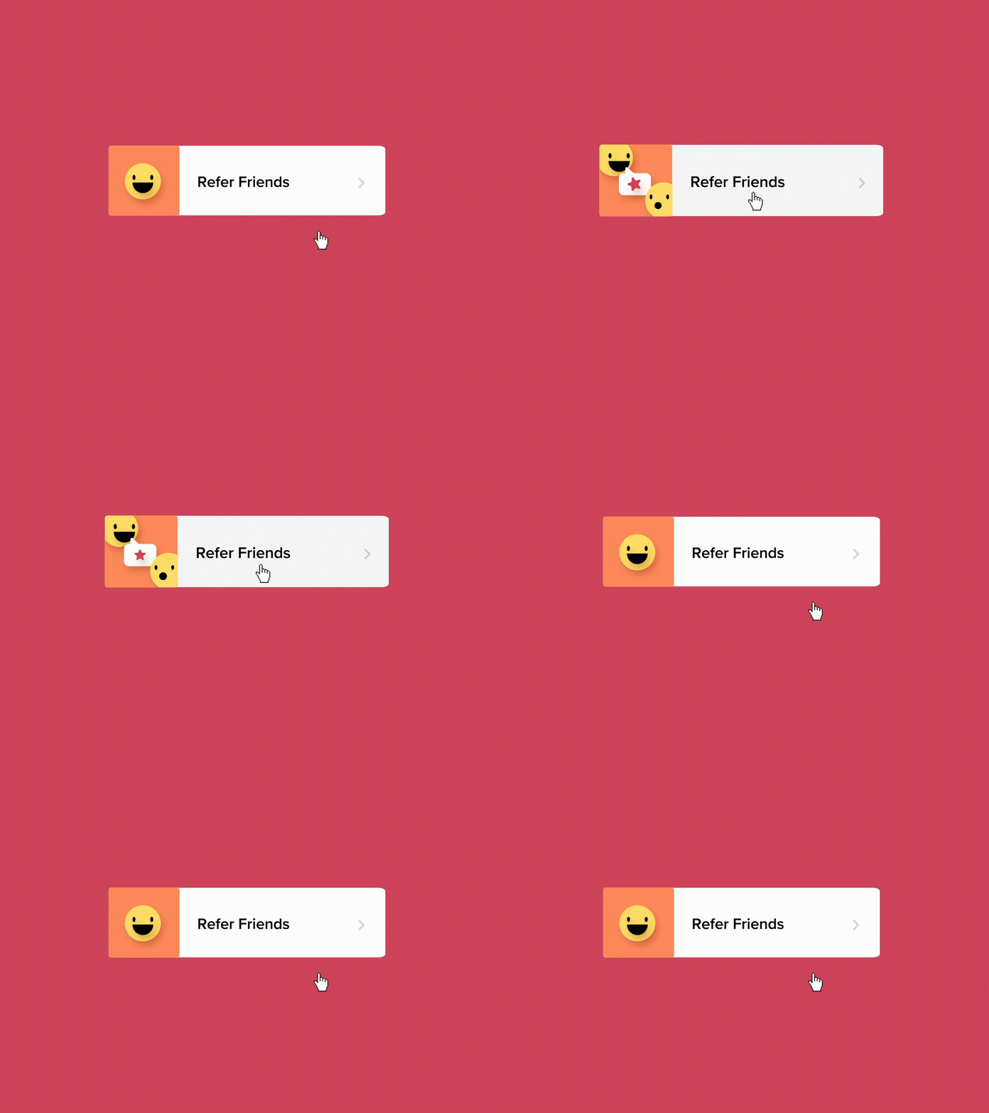
One of the key trends in UI design for 2021 is the use of microinteractions. These are not only used for their aesthetic value but also to give users a sense of control, improve navigation quality, and provide a better user experience. Well-crafted interactions are usually very subtle, and we don’t notice them, but they give us a feeling that we smoothly pass from one part of a process to another, and everything works “as it should.” Examples of interactions are calls to action (i.e., submit button, downloading, add to cart), typing, push to refresh, swiping, or data input, just to name a few. Mesmerizing animations can really take your application to another level. They are visually attractive and necessary to create a sense of “natural movement” and encourage interaction. Don’t hesitate to use them in your future projects! But remember: Microinteractions should be intuitive. If you are using an unusual type of interaction, it is always good to test it and check if it doesn’t cause confusion.
Scrolling
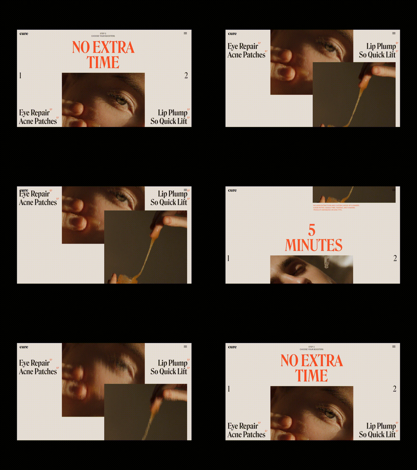
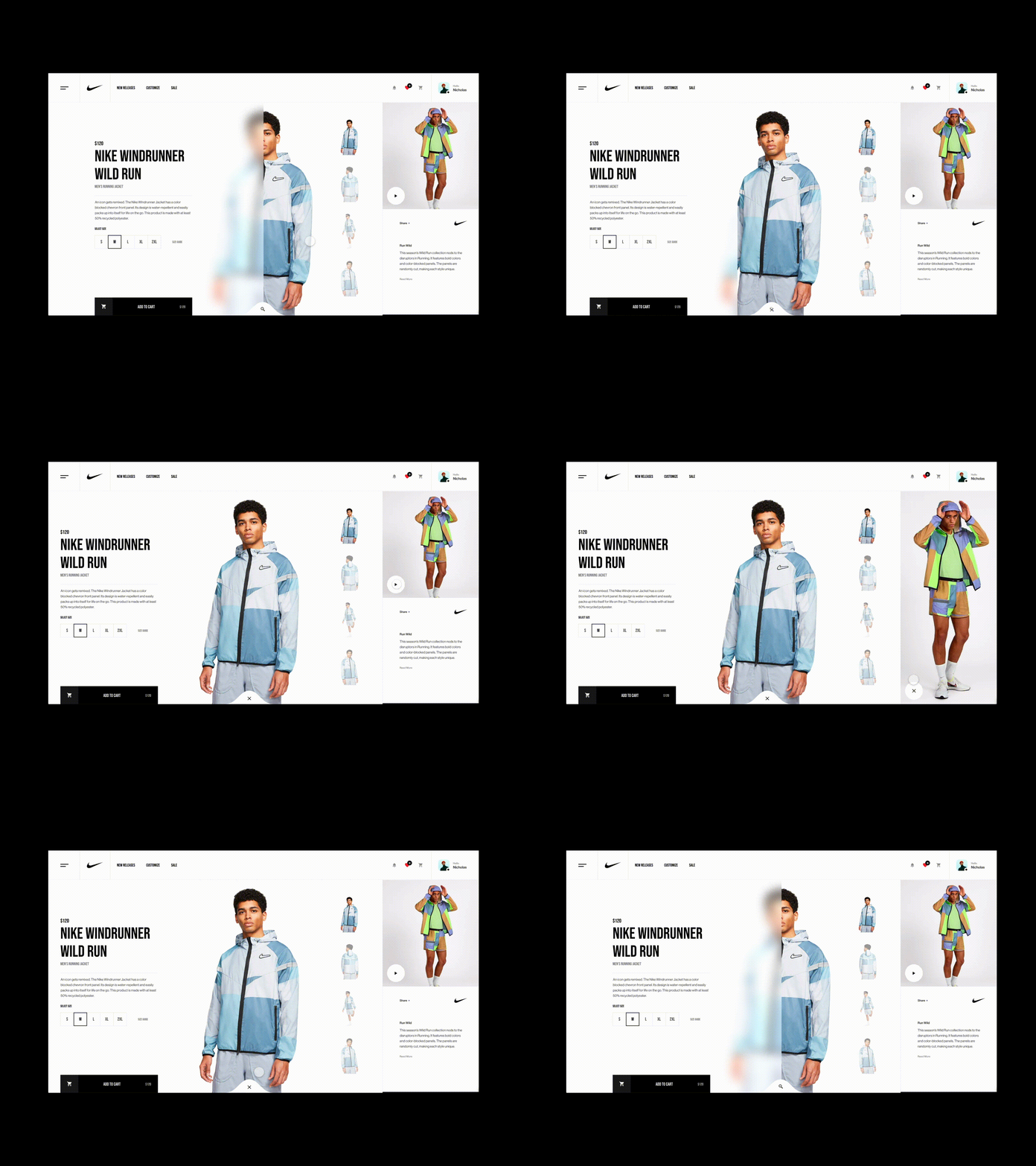
Well-crafted and unexpected scrolling effects will always engage a user’s attention. Some effects, like parallax scroll animations and horizontal scrolling, are (still) very hot this year!
Another trend you should consider while designing is an infinite scroll. Over the years, most mainstream social media platforms, like Facebook, Instagram, or Pinterest, have popularized this effect.
Parallax scroll animations
Parallax scroll animations have been around for a while. They can be very engaging and encourage users to scroll further. I recommend using them for product presentations or storytelling.
Horizontal scroll
A horizontal scroll is an interaction that can make your interface memorable. The downside is that, in some cases, users can feel lost, especially while using it on a mobile display. Make sure that the direction of scrolling is clearly indicated. Remember that there are some exceptions, like a horizontal scroll of cards, which became a standard and don’t always need much explanation. As in the case of any interaction, always test your design before launching — it’s the only way to know if your design fulfills its purpose.
Illustrations
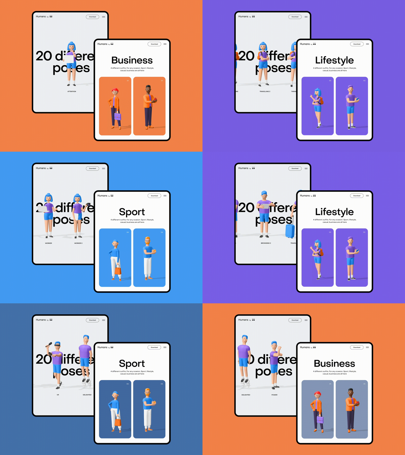
Illustrations, a key element of brand identity, have gained significant importance over the years. Many startups have successfully used illustrations to simplify the understanding of their service or product features, making them an integral part of their brand.
Are you looking for a way to illustrate your product or service? Look at examples of illustration styles trending in 2021 that will allow you to stand out from your competition.
3d illustrations
This trend is undeniably gaining speed. 3d characters, devices, shapes, and realistic elements will give your brand a fresh, modern look.
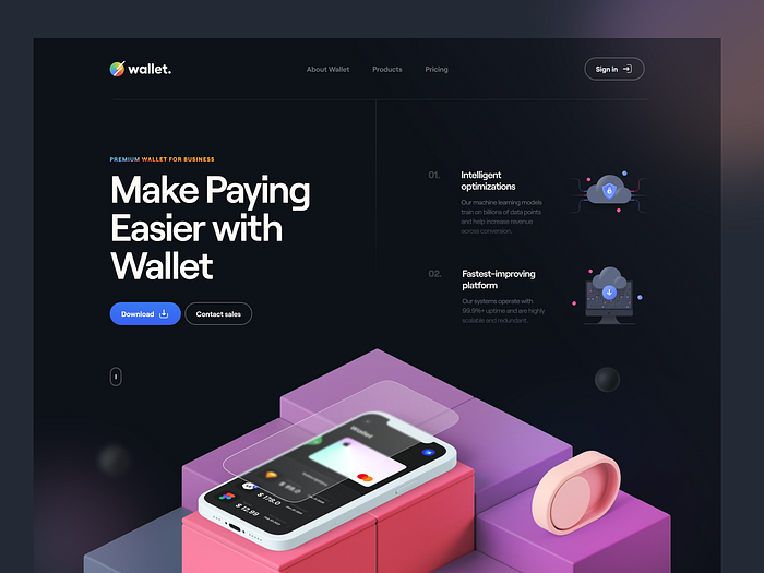
Textures which look real
As technology tries to be as human as possible, the same comes to the visual design and illustration world. We want to see the elements we are familiar with.

Animated illustrations
Even simple animations of your illustration can do a better job than static ones.

Black and white illustrations
We live in a world full of colors, shapes, and information. That’s why sometimes, using black-and-white illustrations can relieve our overstimulated brains. You can use them with equally popular black-and-white interfaces, but they look great, also with some colorful patches.

Glassmorphism
To understand the concept, it is necessary to briefly explain other terms correlated with glassmorphism:
Skeuomorphism
It’s a term that describes a trend of creating interface elements that imitate “the real world.” The purpose is to help users interpret those elements they are already familiar with. It can be applied to interface elements like the trash bin or to the whole interface.

Neumorphism
A hot trend of 2020. Also called neo-skeuomorphism. In contrast to skeuomorphism, which is very explicit, the effects are based on subtle shadows. The screen is less cluttered and more readable.

Glassmorphism
Glassmorphism has become one of the main tendencies in 2021. Glassmorphism uses a blurred glass-like effect, which gives the impression that it would float in the space, creating a pleasing effect of depth. Using it with a subtle line around it is desirable. It gives an impression of the glass edges. Applying this effect, we have to use the right background and make sure that it is accessible to some users with vision problems. To better understand this trend, let’s have a look at this example:
Color trends
Pastel colors
With pastel colors, we can create some gorgeous and modern palettes. They look delightful together and are comfortable and pleasing to the eye. You can combine them with some graceful typography and/or an exciting grid to obtain a simple yet neat and captivating effect.

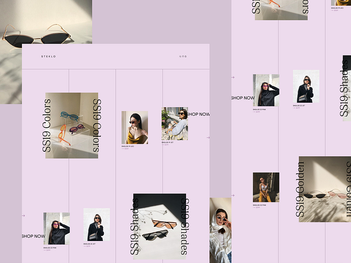
For more “modern” results, mix them with darker colors or/and colors with high saturation levels.

Dull colors
Many designers are tempted to use colors with high saturation. They can be very good-looking and quickly attract attention, but implementing them in large amounts can have a visually overwhelming effect.
That’s why using colors with low saturation (dull colors) can be a good alternative. They can create an exquisite effect or add a more calming overall feel to your brand.
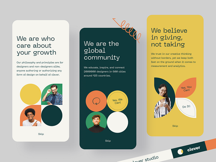
Adding elements from different “families” of colors can create a very charming outcome — just look at the example below, which uses a pastel lilac color as a contrast.

Dark mode
Unlike other elements on our “color trends list, “ dark mode was created more out of necessity than for its aesthetic value; it is used to save battery on some types of screens, such as AMOLED displays.

I recommend using a rather light mode instead of a dark mode, as the human eye is more used to reading dark text on a light background rather than the opposite (unless the content of our interface doesn’t consist of a lot of text).

Colorful gaussian blur
Another very noticeable recent trend in UI design. Gaussian blur is often used to “soften” some elements and, at the same time, emphasize another. It is an easy way to give your interface design a tremendous, unimposing look.

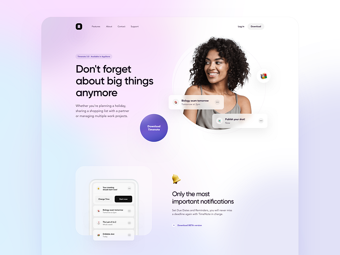
Emoji design
Personally and subjectively, it is one of my favorite trends of the last few years. I really like seeing emojis on landing pages and in apps. They create a more informal ambiance and are a perfect way to briefly express what we have in our minds. At the end of the day, who doesn’t love to use emojis?


Minimalism
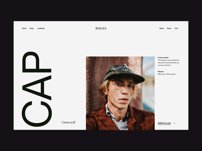
Minimalism, which has been present in different art disciplines for many years, influences UI designers’ style and design choices. The purpose of minimalism is to use only the essentials. We can define a minimalist design as one that could lose its value if we remove any single element. Even though it looks “easy to make,” an outstanding minimalistic design requires an excellent choice of typography, colors, grid, photography, and other components.

To sum up
Some trends are completely new, and some have been around for some time. You can mix them or choose to use just one. In any case, remember that all your visuals should express the spirit of your brand, and your interfaces should be intuitive and accessible to everyone. And never stop experimenting. Who knows — maybe you are the next interface trendsetter!
